UXPA Meetup, Part Two: What's Membership Got to Do With It?

In Part One, I wrote about the process that our team went through in order to generate a proposal for how to meet the business objectives UXPA NYC set forth: 

  • Increase Membership
  • Increase newsletter subscriptions
  • Encourage potential speakers to contact us
  • Encourage potential venues to contact us 
  • Encourage potential sponsors to contact us 

The proposed solution was focused on increasing membership. Our team believed that underlying all of the business objectives was the value of a large, active membership. 

In this post, I will speak about next steps our team would take in order to test the proposal we came up with and the inherent assumptions about members, venues, sponsors, and speakers. The process would flow from identifying participants and goals, establishing the apparatus, establishing the procedure, and analyzing the data. 

    First, we would need to identify the key participants we want to attract and recruit. Since membership is assumed to be the core of what appeals to sponsors, venues, and speakers (VSS) it presents the biggest risk. In order to address that risk first, we will focus on VSS participants:

    1. Identify key demographics
    2. Recruit participants: contact VSS who've had business with UXPANYC in the past, contact successful UXPA chapters to gather recruitment information on their VSS relationships, contact target VSS

    Next, we can identify the goals of the research

    1. Identify drivers for why VSS work with UXPANYC
    2. Describe the process of how VSS work the UXPANYC
    3. Describe the process of how the most successful UXPA chapters operate in regards to VSS

    Next, the apparatus of the study. By apparatus I mean an umbrella term for equipment needed, the types of study methods, and the types of artifacts (website, prototype, etc...). For the above goals we would use:

    • Remote and in person interviews
    • Interview, note-taking, and recording applications to capture data
    • Possibly use the UXPANYC website depending on the ways that VSS enter into contact with UXPANYC

    Defining the procedure would include answering the questions such as:

    • What do participants do when they go through the study? 
    • How will participants be briefed and debriefed during the study?
    • Which interview questions will be asked? 
    • Which tasks and how many, if any, will we expect the participants to perform?  

    Lastly, Analysis---how we will synthesize the information and how to best communicate it effectively to stakeholders. 

    The UXPA NYC event was an excellent experience in learning how UX practitioners can move from general business objectives into a research plan that helps generate insights that could have a massive effect on the design of the organization's products and services. Our assumption was that membership was the core of achieving the different business goals. The impact to the business can be lessened by testing our riskiest assumption: that venues, sponsors, and speakers care most about the size and participation of the UXPA membership community. 

    UXPA Meetup Part One: What's Membership Got to Do With It?

    Membership is the root of all success. That was the conclusion our team came up with as we went through a rapid design process at the UXPA NYC meetup "Ready, Set, Design!" hosted by the XO Group and Greg Dilley on August 23rd. There were about six teams that presented their solutions at the end of the workshop.

    Our Charge

    Our charge was to figure out ways to help solve five different business objectives for UXPA NYC. Those objectives being: 

    • Increase membership  
    • Increase newsletter subscriptions
    • Encourage potential sponsors to contact us
    • Encourage potential speakers to contact us
    • Encourage potential venues to contact us

    Generating ideas based off of limited information

    Each individual on the team began by sketching out four ideas and presenting to the team. After seeing other ideas a pattern began to lightly emerge. The following round we paired up and focused on developing two ideas and presenting that round to the team. At this juncture, an common idea surfaced: membership was the core of all of the business objectives.

    • If we increase membership, we increase newsletter sign ups through the membership funnel
    • If we increase membership, we attract sponsors who are interested in appealing to a large, passionate group of designers
    • If we increase membership, we attract venues who are interested in hosting our events to appeal to a large, reliable crowd
    • If we increase membership, we increase the caliber and number of speakers who are eager to present to the group

    Next we discussed questions we had that would give us more clarity about what membership means. We began to form questions: 

    • Why did you join UXPA? 
    • Describe your experience in joining the organization
    • How has UXPA enriched your life? 
    • How can you better serve UXPA NYC?  
    • Describe the culture of UXPA NYC

    Now, we had some information about the value of membership. So how do we grow the organization? Membership is tied to community and culture. If we focus on communicating the vision, culture, and community of UXPA NYC then we felt we had a good chance of achieving the business objectives. 

    Proposed Solution

    The solution we proposed to the audience was about highlighting personal, relatable stories from the membership. In addition, we discussed ways of building the culture, such as:

    • An oath of ethics when a member joined, to increase identity and credibility
    • Starting high school or college UXPA chapters - in order to grow members who have built their careers from a young age with the UXPA, increasing ownership. 
    • Increasing the number of social, ice-breaking activities that would lead to further immersion into the culture
    • Presenting membership options using an asymmetric dominant (decoy) effect

    The process our team went through over just three rounds allowed a pattern to emerge: that membership was the core business objective. We next built a solution around that assumption. In part two I will go into how we could begin to form ways to test the underlying assumptions about what matters to prospective members, venues, speakers, and sponsors. 

    A Fresh Start

    Entrepreneurship and leadership are learned skills. 

    Too often we think of entrepreneurship and leadership as natural talents. If it's an innate characteristic, then it can't be learned. But if it's a learned skill, like bicycle riding, anyone can do it. That's incredibly powerful. 

    Admittedly, I at times fail at leadership because I have generally found it to be a mystifying skill set and was under the belief, like many others, that it was a natural trait or required an incredibly headstrong, brutish, type-A personality. Having started to listen to the Entreleadership podcast, I’ve realized that I already encompass some leadership traits and my guess is that you do too:

    1. I strive to build relationships with everyone: from office staff to senior leaders and clients. This gives me an understanding of the lay of the land. From a UX perspective, doing this type of work early on in an engagement is critical. There is a small window of time where being the new person, everyone is interested in meeting you and working together.  

    2. I consciously make the connection between vision and grit: vision is the big picture that everyone needs to believe in, grit are the small things we do to get to that dream. It gives us the foundation for what we do and why we are doing it. 

    3. I'm endlessly optimistic. There will be obstacles and it will be a rollercoaster but if there is a guiding vision that makes sense and a communicated goal then we feel empowered and nothing can get in our way. Positive thinking is more than a new age mindset, it's a natural characteristic of our species. Our will to move forward has so far safeguarded our survival. 

    4. Being a UX practitioner and passionate about human behavior in different environments I am obsessed with culture. Cultivating a culture is the most important job of any leader because culture is the source of social norms we find acceptable in said environment. It requires building connections, understanding the temperature of the team, vision, and empowering your people to take on that vision as their own. 

    To continue improvement I have to ask myself, "what biases and opinions do I have that are obscuring my ability to move forward in the right direction?" Thinking that leadership and business are mysterious crafts was one of those biases. They are skills that can be taught, the sooner we all realize that the sooner people will feel the freedom to seek new opportunity. 


    Aligning UX and Strategy to Create the Right Product

    image

    VentureBeat recently posted an excellent article on how companies, especially from the tech sector, see an opportunity to diversify their offerings and do so without aligning the proposed offering with their core strategy and expertise. 

    Now, we can take a look at how user experience is involved in this process and whether an opportunity in a given field is worth the long-term investment. 

    The first layer of user experience is understanding the business and its market and next, defining the objectives of the product. The UX process can access these objectives through collaborative workshops with business leaders, example questions may include:

    • Describe the strategy of the business?
    • What are the activities of the business that reinforce its strategy?
    • How do the activities relate, fit and support with each other?
    • How would you define success? How do the other parts of the business define success? 
    • What are specific problems that a proposed product alleviates?
    • What does this product need to achieve? How does that align with strategy?
    • What need does this product meet? For users? For the business?
    • What effects will this product have on the company? 

    The questions above can be asked in a conversational manner or better, we can have members collaborate on post-its, writing down each concept. This participation creates buy-in and engagement with the client. The aim is to get decision makers to first define their strategy and how the business organizes its activities to support the company. Second, what a proposed product needs to achieve for the company and how it fits in with other activities to support the strategy.  

    The UX process requires defining the overall strategy and how it integrates with the other activities that support the business. Next, with those objectives in mind and constantly validated against, we can move towards defining the product and generating requirements with the client to ensure that they align with defined strategy from a business perspective.

    Aligning business strategy and product UX will make it clear how a proposed product is defined, developed and maintained so that its purpose is worth the long-term, serious investment. 

    How GrubHub's UX has Lessons for your Bottom Line

    Looking at this screen, what can you pick out that could be a problem?

    image

    At face value, nothing is technically wrong in the GrubHub screen. You are given a set of choices and are able to select one; which is an appropriate use of the radio button. But how much money has this business potentially lost because it only allowed patrons to choose just one extra skewer? 

    If we think about providing a better software experience that anticipates our needs, the solution increases efficiency, practicality for both business and customer. So what could be a possible solution?

    image

    image

    With this solution, customers are able to choose multiple skewers, but if a person chooses “No…” then all other checkboxes are disabled and unchecked.  

    Or if we go a little further we could simplify the process:

    image

    Replacing the radio buttons with checkboxes begins the process of improving the flexibility of the app. However, does a customer want to add multiple extras of a type of skewer–three extra chicken skewers, perhaps? Since this is on a mobile device we also have to ensure that target areas for the checkboxes and radio buttons are large enough. We can also think about whether “Save Selection” is the most appropriate label for the button; maybe “Add to Order” or something to that effect is more appropriate. These are just a sample of things we can begin to think about to improve GrubHub.

    To take it another step further, we can also think about how the extra options will be presented to the customer. Currently, a person has to select “Would you like to add an extra skewer” in the screen below the pop up before being presented with the actual options.

    image

    But what if extras were presented automatically after a main order was chosen? It may lead to increased revenue for both GrubHub and the restaurant.   

    In addition, it is easy to measure how these changes will affect your customers. Designers can use A/B testing, paper prototypes and many other methods to determine whether the interactions they have chosen fit with your customer base. 

    Providing UX that is more closely aligned with a customer’s real-world, and manipulating it in a way that they are likely to order more, has the potential to dramatically increase revenue for businesses. The UX design process ensures a return on investment by going through these issues and aligning solutions between business goals and customer satisfaction.


    A Brief UX Dissection of Writing a Yelp Review

    Often times I am asked about the process I would have a team institute in order to improve a product. As a first pass, I typically will look at a specific flow that has high business impact and look for possible pitfalls common for end-users. This may occur typically before moving to thinking about redesigning the flow and/or interface. Ideally usability testing occurs before and after the examination so as to set some baseline measures of what users encounter and whether the redesign is effective in improving business and user goals. 

    Recently, I performed a review of how users write yelp reviews. 

    Main Page

    image

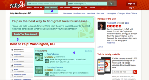
    Based on the initial page of Yelp, we can assume that writing a review is not the most important feature. However, user acquisition (3), searching for a product/service (1) and the reviews themselves (4) seem to be the top priority of the business based on the prominence of those elements. As I have chosen to base this post on Writing a Review (2) we will move forward in regard to that flow. 

    Write a Review

    image

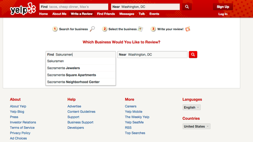
    The Write a Review section does an adequate job of directing users by following the method of Search for business, Select the business and Write your review. Users can also proceed in the same way by searching from the home page instead of going to Write a Review first. However, the paths diverge at that point briefly. 

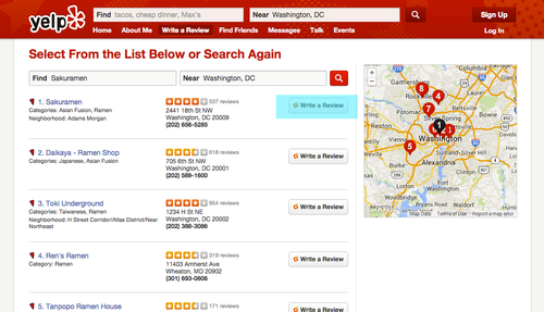
    Searching from Write a Review

    image

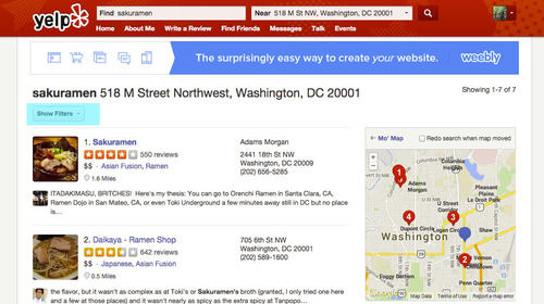
    Searching from search on main page

    image

    Notice the differences? 

    Users may wish to Filter results from the Write a Review search engine and users who had searched for a business from the main page search may want to Write a Review right away. Allowing users to access those features from either path would likely give them more consistency and I would suspect they would not need to remember “How did I get to that page again? I knew it involved search.”

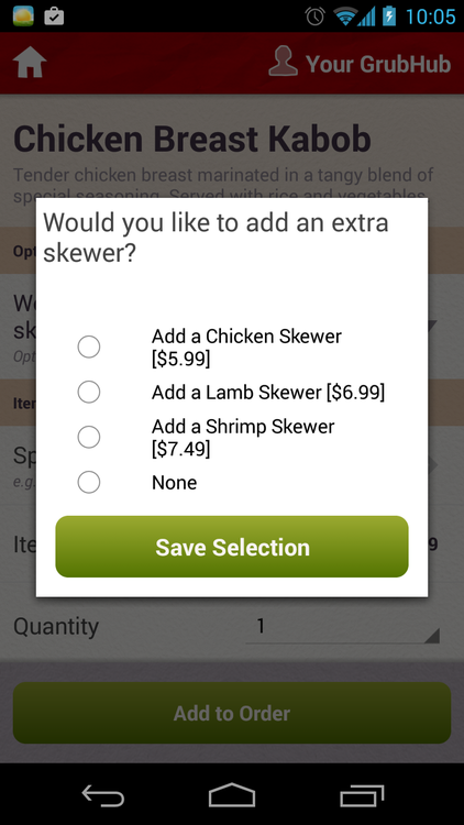
    After a user decides to write a review and move forward with posting, if they are not logged in they are presented with: 

    image

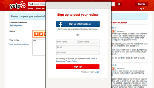
    If a user is logged into Yelp then they may post the review right away. However, if a user has yet to login, she is presented with a modal with options to sign up. This is a fantastic way of engaging users before they use the product; allowing them to pursue the path of writing a review and only waiting until the last moment to ask for a sign up. The user, having successfully used the product, is more inclined to sign up after they have put the effort of writing and rating a review. 

    Confirmation

    image

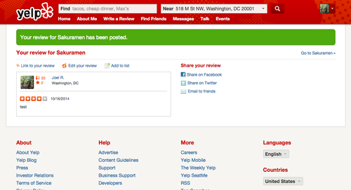
    After a user successfully uploads his review, he is presented, correctly, with a confirmation message. This is great practice as it provides essential feedback that the system operated successfully. The user is also given options to immediately share the review on his social network. 

    Edit Review

    image

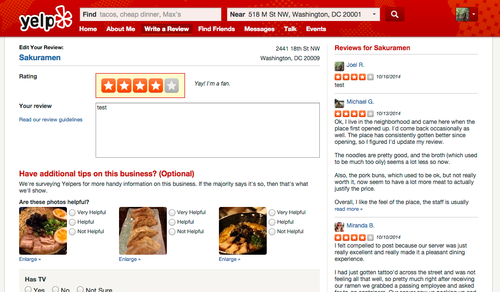
    When a user wishes to edit their review, they are given additional options on how to characterize it by adding additional tips. This is a feature that would have been helpful had it been presented before the user uploaded their first review. Why are the “additional tips” not presented during the initial review stage?

    The reason that I had elected to edit the review was because I had been seeking a way to delete the review. However, you cannot delete the review from the edit review section. This seems to be a possible usability problem and I would theorize that users have difficulty deleting their reviews. This may be intentional on the part of the business to maintain the volume of reviews. 

    Delete Review

    image

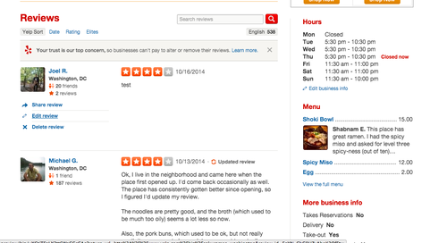
    In order to delete the review, users have to actually have to go about it in a way that I would theorize does not fit within their mental model. The user has to:

    1. Search for the business
    2. Find their respective review
    3. Delete the review.

    I would suggest that many, if not the vast majority of users, expect to be able to delete their review primarily from the edit review section as well as having the option to delete from the restaurant review page. 

    Deletion Confirmation

    image

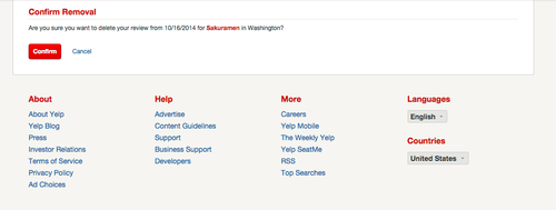
    Users should not have to confirm removal of their deletion. The ability to undo the deletion would work much better and would be a more efficient process. 

    image

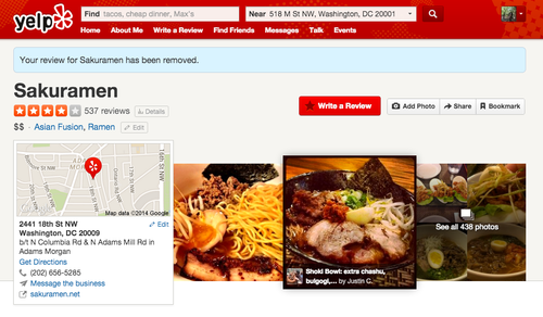
    After a review has been removed, Yelp confirms the action with a message; which is great usability practice. However, again, skipping the confirmation page for removal and allowing the user to undo the action from this confirmation message would be better. 

    Overall, Yelp provides a good experience for writing a review based on how reviews fit within their apparent business model. However, there are some possible fixes that would enhance the user experience in list of priority:

    1. Search results either through the main search or the Write a Review search should be consistent. This will allow users to take full advantage of writing reviews and filtering businesses using a consistent results page.
    2. Allow users to add “additional tips” when they are first writing a review
    3. Allow users to delete a review from the Edit Review page
    4. Substitute confirmation for deleting a review with ability to undo instead

    UX, product and business can theorize about problems and obstacles for users all day long but without the benefit of usability testing we are not sure how changes will affect their ability to be awesome. And, I mean that; Awesome. Users want to use your product because they believe it makes them better at what they do. 

    Some steps a product team may take upon themselves to improve a product with these types of obstacles: 

    1. Paper sketches and paper prototypes for proposed changes
    2. Test with users and stakeholders
    3. Iterate on design and test again OR move to digital/code prototypes
    4. Test digital/code prototypes
    5. Iterate on design and test again
    6. Based on testing results, submit remarks on why changes are important and how they will affect business
    7. Elaborate with developers (Ideally at least one developer engaged in the process early on). 
    8. After changes made to product, take a look at data coming back from analytics to confirm or reevaluate design solution

    Becoming a UX Shakespeare

    UX designers are writers. We frequently write system messages and seek ways to more clearly communicate the status of our respective systems to users.

    What makes good UX writing? First and foremost, the technical and functional aspects of the message need to be communicated in as straightforward a way as possible. I will use this screenshot from Whatsapp as our specimen for examination: 

    Here, the functional aspects of the message are at the head “[System] Waiting to automatically detect SMS sent to…” The system is telling the user what is technically occurring. 

    Next, the copy moves into a section that gives the application the extra push and personality. First, we are greeted with a courteous “Please make sure you have a working SMS plan.” This anticipates a possible problem if the functionality of auto-detection fails to go through. Then, Whatsapp does the most important thing to improve the app’s relationship with its user. The copy uses a warm and welcoming message of “Sit back and relax. We’ll notify you when we’re done everything.” It may only be one line but it is crucial; the system is acknowledging that it is speaking to a human. 

    The ultimate message then is one that is technically sound and human. You can begin to iterate on system messages by meeting with team members and reading the messages out loud to each other. This reinforces human communication in the system and is overall a good practice in streamlining the content.

    The World is Flat and iOS Apps Will Be Too

    Rumors are running rampant across tech media outlets, including Gizmodo and Bloomberg, about a major visual and architectural overhaul of the user interface design for Apple’s iPhone and iPad applications. If the rumors prove to be true for iOS 7, what does this mean for your business and for your mobile products?

    In the short term, Apple is likely to change the visual design to be more “flat” but would keep many of the interactions familiar. What does “flat” mean? It would mean less of a textured feel for objects like app icons, menu bars, headers, and the like. Items that would potentially be gone or radically changed would be rounded corners, drop shadows, glosses, and other effects that give Apple’s icons and OS their signature look.

    It’s unlikely to impossible that the changes Apple makes to its user interface design will require wholesale changes to applications that already exist in the marketplace. Long term, however, this likely means that iPhone and iPad applications will need to be responsive to future changes, as well as evolve their visual presentation.

    Microsoft has already gone towards a flat aesthetic with the release of Windows 8 and it has had a dramatic (in some cases, negative) effect on users, products and developers. With the movement towards a cleaner, bolder aesthetic across the web, companies will need to re-assess their mobile branding to keep their looks fresh. Updating your products to a flat aesthetic requires even closer attention to understanding users and their ability to distinguish interactive elements.

    3 Pillar Global’s UX team can help your business transition and develop a user research regimen in order to take advantage of the evolving visual design landscape while also protecting your customers from confusion. See our product design page to find out more about how we work with clients from a user experience standpoint.

    The Best Interface is No Interface SXSW 2013

    Austin, Texas’ SXSWfestival is generally known as a cutting edge scene for the music industry. However, the first half of the gathering is an interactive industry event with startups, NASA, internet memes and cutting-edge technologies vying for the attention of the audience.

    One of the highlights of SXSW was Golden Krishna’s presentation titled “The Best Interface is No Interface.” Krishna’s argument throughout the well-planned talk was that companies are relying too heavily on interfaces that do not solve actual problems. Instead, software should leverage the power of computing, sensors and systems to follow the flow of the user, not the device. His manifesto is based on three principles: 1. Eliminate interfaces to embrace natural processes, 2. Leverage computers instead of catering to them and 3. Create a system that adapts for people. 
     
    His golden example of no UI was the investment and creation of several apps by different car companies that allowed owners to unlock their vehicles via their smartphone. At face value the product seems like it could have some value because we constantly use our devices: “I can open my car via my phone!” However, a person would have to go through no less than 13 steps before being able to actually open their car door. Whereas, vehicle owners usually go through only three steps: 1. Pull key out, 2. Enter key, and 3. Open door. It is worth noting that Golden Krishna’s presentation was not about getting rid of interfaces for devices; users will always need the freedom to control the product within certain constraints. Krishna also is sure to highlight products that are innovative without an obtrusive interface such as Mercedes-Benz’ keyless entry developed in 1999 (embedded below).
     
     
    When deciding to pursue a product, enterprises must begin to brainstorm and critically think about how to leverage sensors and systems that delve deep into the behaviors of their users. 3Pillar Global’s UX team can help your company research and understand the obstacles that your users encounter and design solutions that take those factors into account. Solving common problems leads to innovative solutions that create returns on investment.

    Education and Design Thinking

    At last month’s Harvard xDesign By Design conference, I had the opportunity to work with a multidisciplinary team of designers, engineers, and business leaders to tackle the challenge of identifying deficiencies in educational systems and their approach towards developing students.

    The result of our brainstorming session was an educational framework based on bringing design thinking and engagement to students in all grades. Why is it important to infuse this kind of thinking in students at an early age? Governments and businesses face huge challenges in educating students in an economy where the predictability of industrialization is not a given. In an era where technology often outpaces skill sets, the need to develop students who are able to be responsive to a fast changing economy and government built on accessibility to information, creative solutions and technology is imperative. 

    The framework team 11 that I worked with created and implemented a “studio environment” core made up of, fittingly, three pillars: inquiry, social support, and interdisciplinary education. Inquiry begins with engagement and an open environment where problems are proposed by teachers, and students are free to create solutions and ask questions. In addition, students would have access to their teachers during the most important part of the learning process: solving the problem. Thus, the role of the teacher would be to provide insight, encourage critique and oversee social support. 

    The social support pillar would emphasize collaborative environments whereby senior students and others from their peer group would be on the vanguard alongside trained teachers. These senior students would develop as leaders as they would be able to provide guidance to younger students: building empathy and social norms.

    The third pillar, interdisciplinary education, contributes to a studio environment where the relations between other objects and topics is shared. Business environments produce innovative solutions based on the cohesiveness of interdisciplinary teams. The design team I was involved with was interested in exploring how to continue the excitement and creative energies that students have during the first years of school. We looked at kindergarten environments and found that they were immersed in interdisciplinary rooms. Students had access to creative materials and were commonly tasked with exploring their creative abilities. This energy and environment decreases throughout middle and high school and increases again during late college and graduate studies. The framework we created would encourage the production of strategies to break down the barriers between subject areas, increase engagement and provide environments where teachers from each field can guide students through the problem solving process. 

    Proposing education reform is a fraught and meticulous process obstructed by entrenched 19th century institutions built on a model of delineating students into two categories: academic and vocational. The obstacles to solving institutional problems in education that the design challenge teams were tasked with solving are major. The Harvard Design Challenge was a beginning of a process and an inspiration that clearly demonstrated that multidisciplinary teams built on perspectives from business, engineering and design are able to work quickly to provide frameworks for meaningful reform.

    UX Design

    I am a UX professional that has worked in a wide variety of industries. This space will be used to expand upon my experiences as a consultant and I expect to share ideas, struggles and insights with businesses, UX designers and developers.